Do Not Fear Dark
- Ainslie Gilles-Patel
- Mar 19, 2023
- 3 min read
Updated: Mar 21, 2023
It's only dawned on me today that I may just be afraid of the dark. No, I'm not talking about night time or the Boogey Man; I'm referring to the use of dark values and tones in my art.
For many years, I worked almost exclusively on black paper. Why? Because when you use soft pastels on black paper the pure, vibrant pigment POPS off the darkest value background. The same is true for white charcoal pencil - a yin and yang of art materials. And, if like me, you love pastels and charcoal, and things that excite the eye, then working this way is addictive, and as I learned, quite difficult to quit. It takes a sharp, tuned eye to work on black paper, but like ducks to water I took to it immediately.
In 2019, whilst living in the UK, I followed my cervus (deer) heart and dedicated the entire year to drawing them and using mixed media. I made a calculated decision to go cold turkey and stop using black paper. As I worked, one artwork after another, something interesting took shape: I was drawn (excuse the pun) to light. And found myself quite unable to use dark in my art. Yes, I used charcoal pencil in most of my mixed media art, but as you can see in my body of work from this time, there are zero dark values in my work. It was almost as if I had learned to become afraid of the dark.
How did I manage to do a 360 degree turnaround? I think I have the answer. Around the same time as I told myself I was no longer going to be using black paper (wahhh!), I also told myself that I wanted my art to be more ethereal. What does that mean, exactly? In my mind, ethereal is a look but also a feeling. It looks dreamy and light and beautiful. It feels comforting, peaceful and safe. And so there you have it - words like light and safe to me immediately bring a vision of NO DARK VALUES. No Darth Vader in my studio! And so, dark values were banished - missing since 2019. There were tiny glimpses in 2020 and 2022, but that was fleeting.
It's time to launch a (wo)man search, and go out and find Dark Values. I'm going to find it and tame it. I'm going to learn to like it again and eventually, I'm gonna love it. I will challenge myself to bring the dark back into my work, and see and feel the same connection I do with light and middle values. There is a sense of anchoring, of strength and depth with using dark values. It could convey mystery or drama, and that doesn't need to equate negativity. It's all in the mind; the way you think, act and respond is no different in the art world. I can retrain my mind and not only learn to enjoy using dark values again, but even thrive. We all know how it works: Dark is evil. Light is good, or pure or angelic. Do not fear dark nor think that light is better. Without light, there is no dark. And without dark, there is no light.
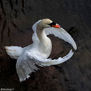
I've started by using my photography as a guinea pig, so to speak. I've scoured my files of photos to find ones that can be edited to mainly dark values. Now, I'm obsessed with doing this and no photo is safe! But it's been a great place for me to start. Next, it's about going into the studio and starting with something in there. Doesn't need to be anything extravagant or worthy - it just needs to be something. I've never been a fan of black, (except, of course, black pastel paper!) but I love dark blues and turquoises, and greys. Perhaps I'll surprise myself and one day use black, but there's no rush. Whilst I am enjoying my light days, I have a sense of wanting to explore using dark values, which is a good sign I'm ready and willing.
Back in 2009, I created an artwork that was stuck in my mind: an Arabian stallion with his head up and ears forward, with flowing mane and flared nostrils, moving out of the dark and into the light. I drew what was playing over and over in my head and titled it INTO THE LIGHT. I look at this piece now and clearly see a perfect harmony of light/dark. No fear. No evil. The light isn't pure or angelic, it's just part of the picture. Light isn't getting all the glory because dark is it's partner - just like yin and yang.
Both are equal. Both are interconnected. And both are beautiful.


